Adobe Photoshop, Adobe Illustrator, Mozilla Firefox
My Timeline
3 Months
The Deliverable
An updated, fresh look for social posts
Learn Learn potential candidate roadblocks and deficiencies (What has worked, what hasn’t). Study and absorb updated brand vision and company goals.
Re-Design Create an updated look and feel that can be adapted across job families – while retaining an overall sense of playfulness, enthusiasm and energy.
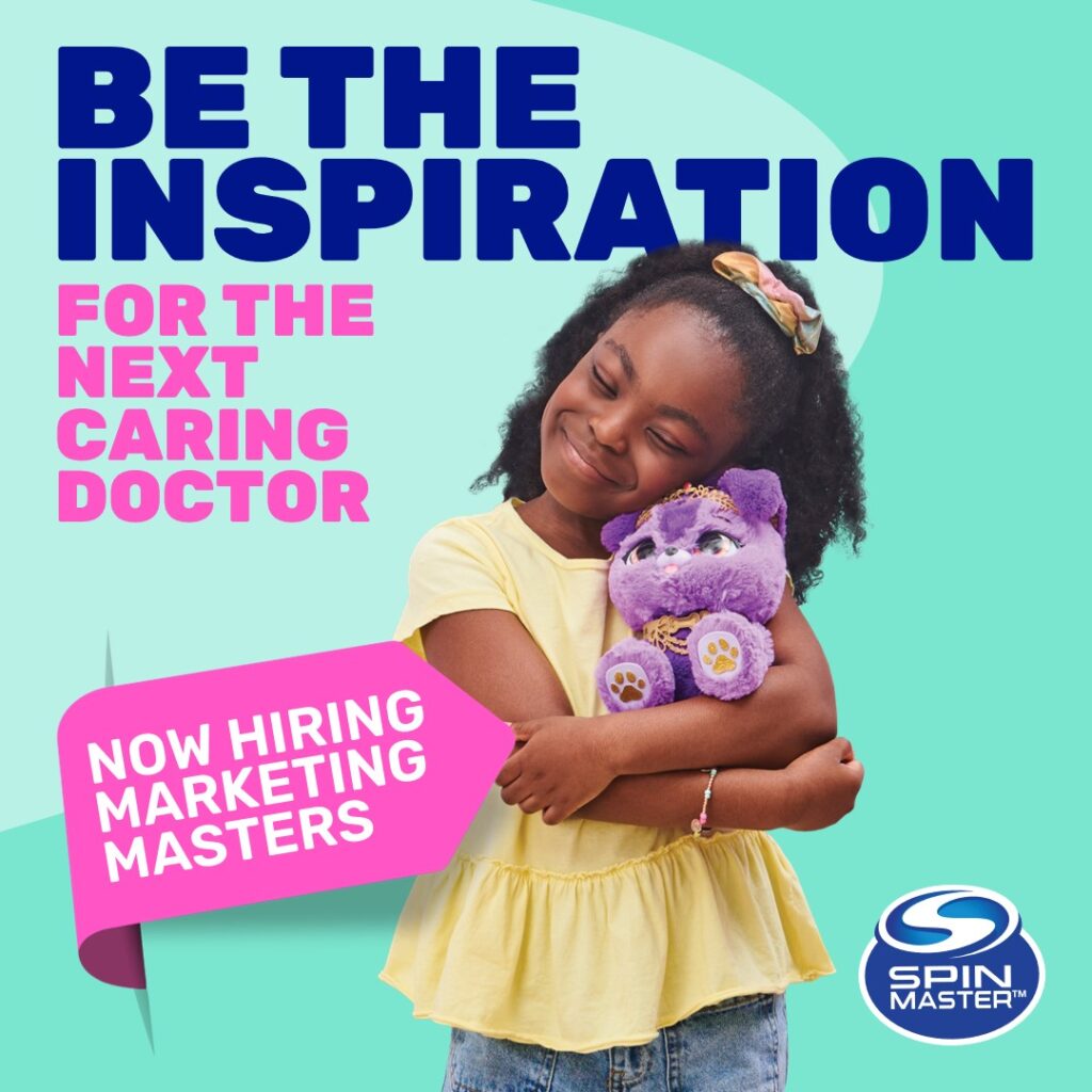
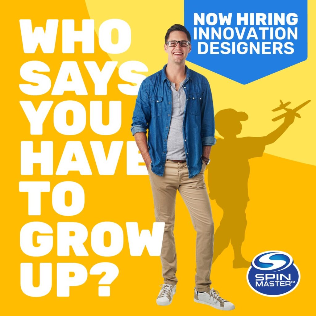
Enhance Using the Spin Master brand, develop enhanced targeted digital recruitment speaking to specific job families.
Stylize Using wireframing and design software, create highly visual, impactful designs.
Hand-off Package assets into easily navigable folders for internal implementation.
Project Overview
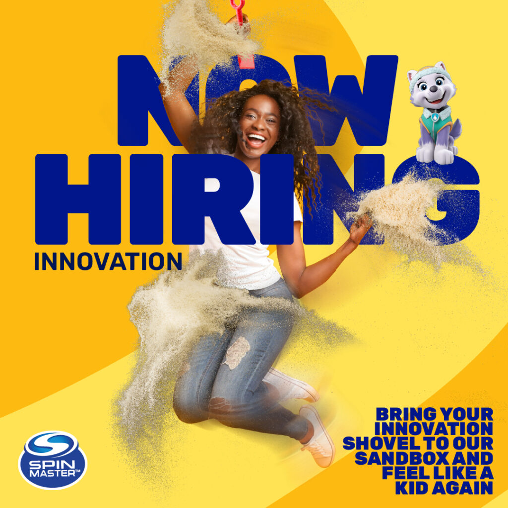
Rediscovering the kid in you.
One of the common themes from key stake holders was that they wanted the language and look and feel to match the energy and playfulness of the brand, and that of the experiences in enjoying Spin Master products.
The ads needed to compliment the brand, speak to specific job families yet be scalable, and adaptable for other banners or executions.
My role was to work with key stake holders to establish their vision and expectations for the work, as well as provide expertise on what works best through research and experience on achieving top results for talent attraction.
2000+
2000+ employees across the globe
28
28 offices worldwide
$2B+
$2+ Billion dollars in annual revenue
Project Goals
How might we attract the right candidates while showcasing the updated brand and EVP (Employee Value Promise)?
Showcase the Spin Master employer brand
Attract the right candidates
Introduce job families in a creative way
Format • Social Posts
Pages 4 Ads that were scalable and adaptable to other job families and roles
Development Time <3 months
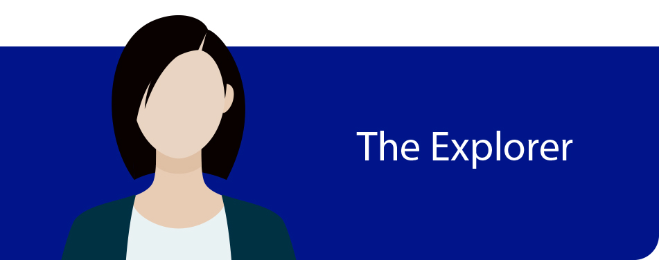
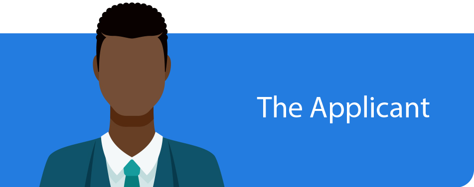
Defining our Broad Scope Personas.
Todays workforce is comprised of Millennials, Gen Xers, Baby Boomers, and Traditionalists
Job Family • Corporate and Management • Operations • Marketing
Motivation: Career Advancement, New Role, Full-time Employment Behaviour: Exploratory Needs: Wanting more information on Spin Master Looking for: Why work there, Career paths, and what it takes to succeed
Job Family • Engineering • Inventor Relations • Creative
Motivation: Role focused within their area of expertise, Full-time Employment Behaviour: Quick to apply for a specific role Needs: Knows the role they’re looking for, may seek transient role Looking for: A quick and easy path to apply for a specific role
Hearing from the Employer
Intake questionnaires and interviews were conducted with key stakeholders on what they hoped the applicant experience would be, deficiencies with the current site and expectations to guide the redesign.
Provide 2-3 key must haves for the relaunch that the current site isn’t delivering on.
Describe any pain points that applicants may be experiencing when looking for employment at Spin Master using the career site.
What features/styles work with the current site that you’d like to see migrated over? Please summarize what you feel isn’t working with the current site (look and feel, ease of navigation etc…)
Design
Our guiding principles
Minimize copy
Incorporate a mix of high impact visuals
Adopt a user-centered design approach
Develop simplified journey maps
Integrate EVP messaging & creative
Explore best/next practices (chatbots, visual job descriptions, live hiring manager)
Rework Copy to better reflect Spin Master Tone of Voice while adhering to SEO best practices
Establishing the Styles
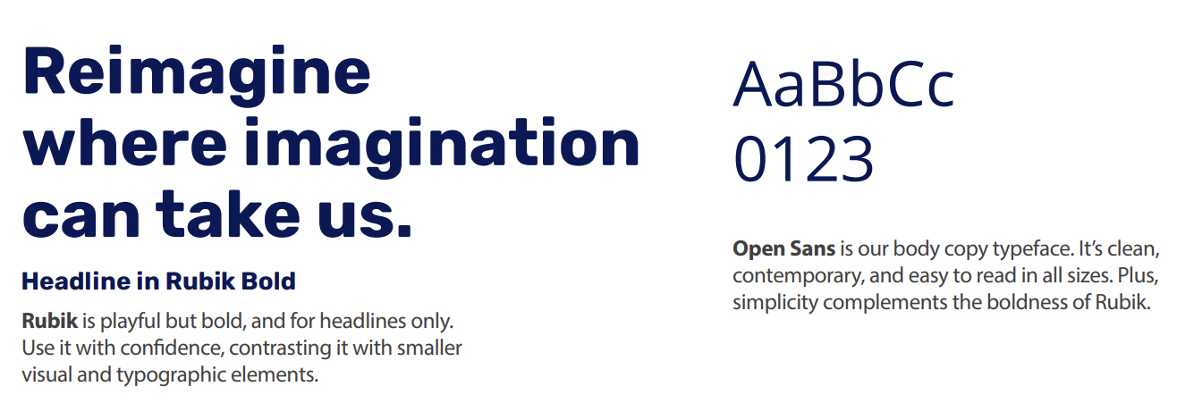
Rubiks and Open Sans was chosen to be highly accessible to site visitors and best align with the constraints of the CMS the site would be developed on.
The brand palette provided direction but would require some adjustment to meet AODA contrast compliance.
Photography that complimented the brand palette would be prioritized.
Iconography using a light outline format would be chosen to compliment the clean colourful look.
This fresh, bold and playful colour palette represents our forward thinking innovation, serious smarts and playful attitude.
Imagery and Character Assets
Iconography
Iterating on the visual design.
Multiple designs were explored by our team and tested with the client.
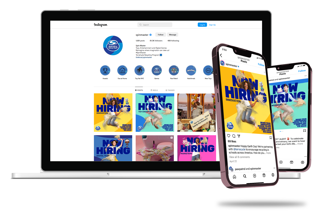
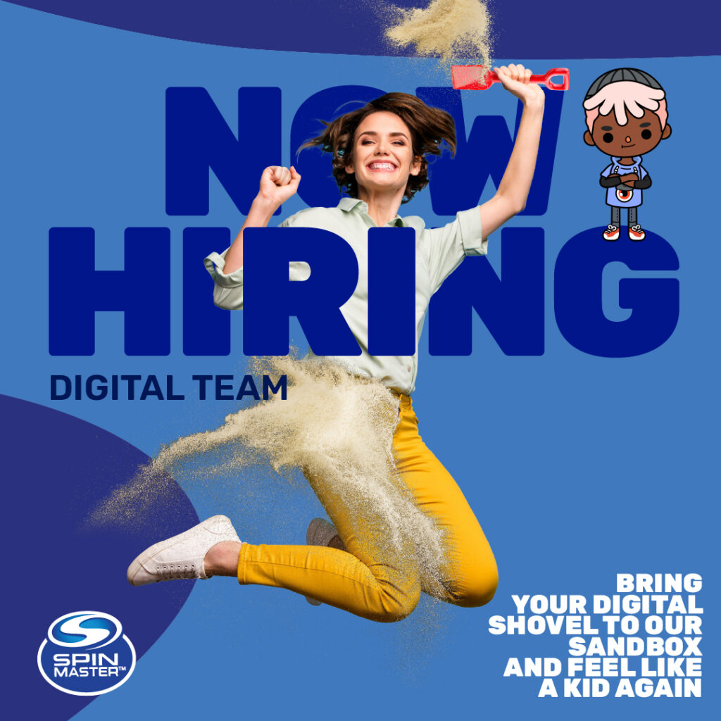
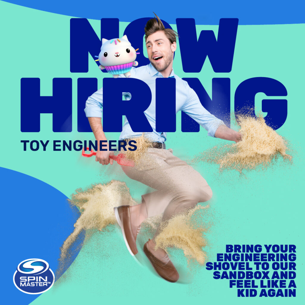
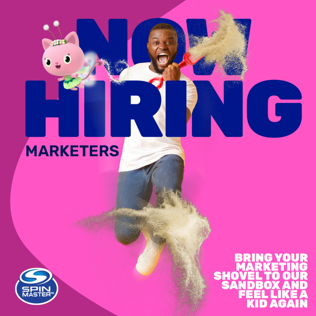
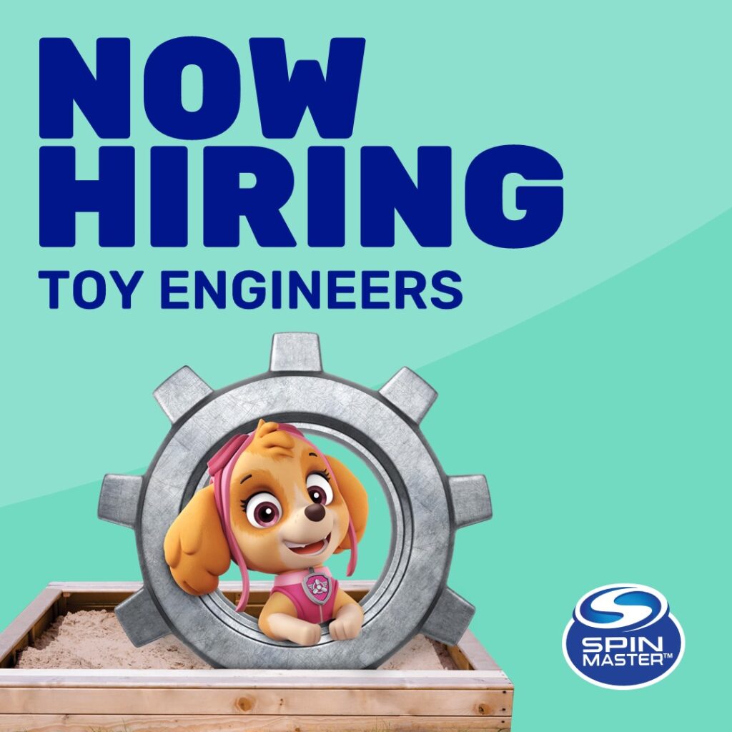
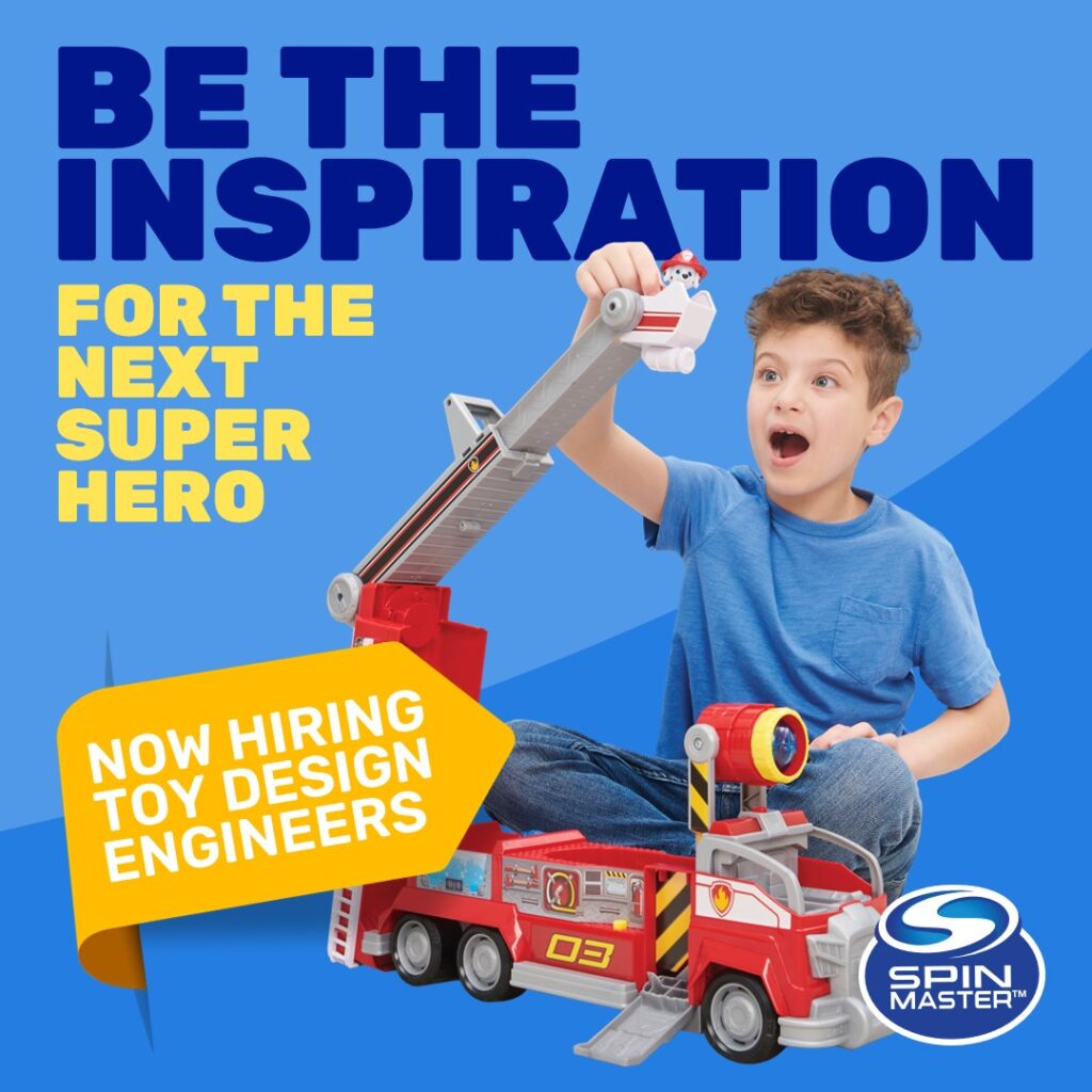
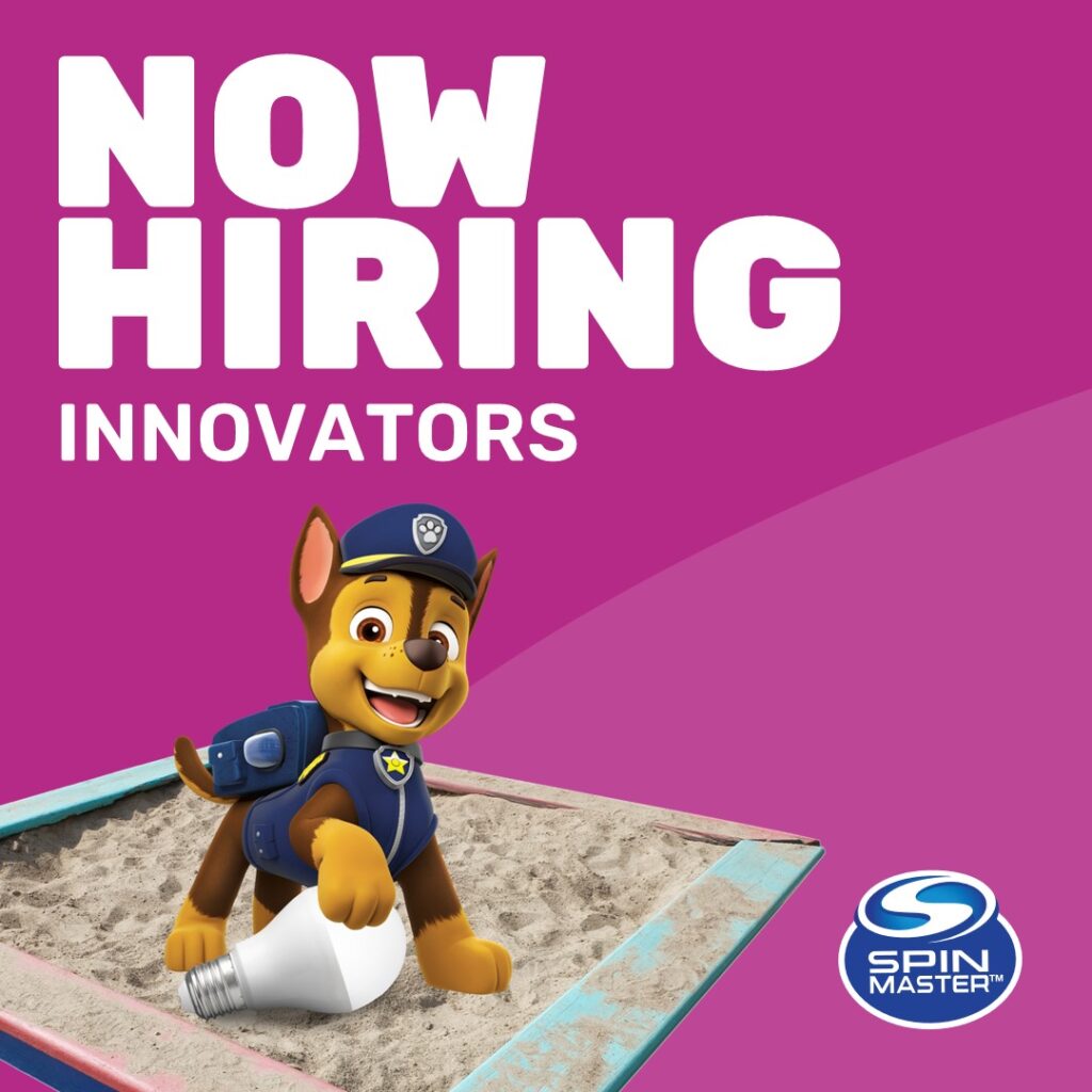
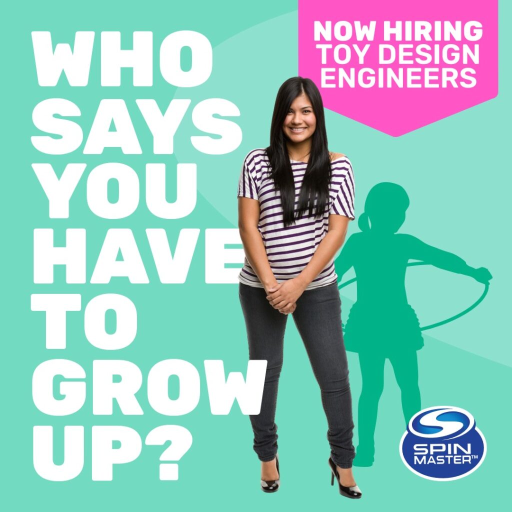
Final Design
The updated versions of their targeted ads were impactful and visually creative, generating an increase in candidate clicks and curiosity.
A much bolder use of colour was introduced to compliment the playfulness and energy depicted within the brand.
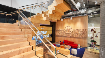
Developer Hand-off
Our team prepared all the hand-off materials so that Spin Master’s team could work with our files internally and change key elements without damaging the intended look and feel.
In working in tandem with the their team we were able to meet client expectations.
Final Thoughts
All client requests were met and a more elegant, user friendly career site was delivered. The look and feel of the website is more in-tune with their brand both in terms of visual aesthetics and tone of voice. Functionality and usability has also been enhanced to create a much easier path for applicants to find what they’re looking for in terms of roles or departments. The site design is now streamlined and persona-driven, offering candidates the ability to see the Spin Master enterprise at-a-glance and easily apply to available roles across the globe. Candidates can explore departments and roles with additional detail, and the ability to apply is always present.